Blue color symbolism refers to the meanings and associations linked to the color blue across cultures and contexts. Frequently associated with peace, transparency and profundity, it manifests itself in the natural world as expansive sky and ocean, informing the way we interpret its emotional tone.
In design and wellness, the color connotes trust, stability and cool equilibrium. Spiritual traditions link it to communication and the throat chakra.
In the following post we survey the history, differences and applications of the color blue!
Key Takeaways
- Blue represents calm, stability, and trust, which is why brands, uniforms, and wellness spaces love it. Lighter blues soothe and open a room. Darker blues project authority and reliability.
- Blue affects mood and concentration by decreasing stress and promoting mental clarity. Try soft azure shades in bedrooms and meditation spaces. Use deeper shades in study areas to increase focus.
- The color is synonymous with sadness and apathy, particularly in its darker, grayish shades. Balance blue with warm accents or natural textures; otherwise, it will feel cold or detached.
- Blue’s cultural symbolism ranges from spiritual and protective powers to mourning. When designing or talking globally, select colors and symbols carefully and supplement with context as appropriate.
- Blue rules online for its reliable vibe. Blue light wrecks sleep. Turn on device night modes in the evening and select blue judiciously in interfaces where you need unambiguous calls to action.
- In holistic traditions, it is linked to the throat chakra, communication and truth, bolstered by crystals such as lapis lazuli, turquoise and celestite. Attempt mindful breathwork, colored lighting, or a crystal in your desk to inspire calm clarity.
The Psychology of Blue
Blue conveys tranquility, security, and dependability. Brands pick this color to indicate professionalism and safety, and uniforms in healthcare and law enforcement tap into the same cues. Lighter and mid-tones can relieve tension and promote lucidity, while dark azures can feel heavy or pensive.
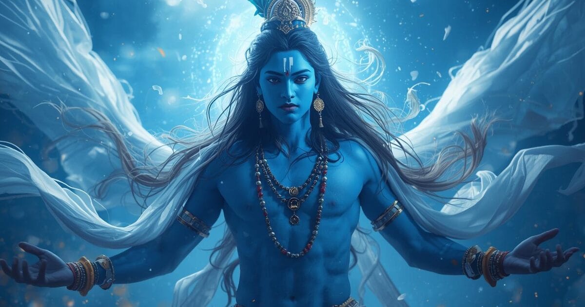
Across cultures, meanings shift: loyalty and honesty in Japan, immortality in China, and sacred wisdom in India through the third eye and the deity Krishna. Blue associates with communication, particularly one-on-one conversation and personal expression.
1. Calmness
It is most known as being calming. Evidence-based studies conducted in controlled environments demonstrate that blue rooms reduce heart rate and slightly lower blood pressure, which a lot of us experience as calm breathing and quieter mind chatter.
Sky and pale, misty blues are common in bedrooms, spas and yoga studios because they silence visual clutter and coax the body into parasympathetic rest. A soft shaded throw, linen curtains or a matte wall can do.
Wallpaper with soft blue patterns and minimalist blue highlights, ceramic vases, cotton cushions, and a woven rug sculpt a composed ambiance without chilling a room. Color therapy groups blue in the calm clan, so it shows up in meditation nooks, mindfulness applications, and breathwork imagery to signal security and comfort.
2. Trust
Blue logos evoke trust, responsibility, honesty, and loyalty. This is why banks, tech firms, and health platforms rely on cobalt, navy, and slate.
A navy suit, a crisp blue shirt or royal blue dress speaks to reliability and quiet authority at interviews, conferences and client meetings. Darker tones read conservative and steady. They temper risk and boost perceived competence.
Hospital and police uniforms often lean toward blue because the color suggests discipline, expertise, and soothing command. It combines strength with warmth derived from centuries of use and exposure.
3. Sadness
Blue speaks to melancholy and depression, such as ‘feeling blue’ and ‘blue Monday.’ In music and art, it is frequently a sign of yearning. Darker shades, midnight and deep navy, can usher in somber, reflective moods. They draw focus inward.
Artists use it to convey fragility, mourning, or remoteness — consider subdued washes that suspend hush between strokes. That same color soothes, creating a multifaceted rainbow that grounds while honoring grief.
4. Apathy
Some pale or grayish blues can feel disengaged or under-inspired, particularly over expansive smooth surfaces. Too much can feel cold or uncaring. Designers will sometimes choose it to calm arousal in waiting rooms or paperwork-laden environments.
BACKGROUND IS IMPORTANT. Make sure to use warmer materials—wood, plants, soft textiles—to offset the cold and bring the room back to equilibrium – and don’t forget to decide on color after seeing it in both shadow and sunlight!
5. Intellect
Blue associates with logic, clarity, and careful thought. Research labs, classrooms, and offices paint their walls mid-tone blues to bolster concentration and minimize disruptions. It represents wisdom, such as teachers’ robes and scholarly seals, and in India it coincides with knowledge via the third eye and Krishna.
Examples where it aids cognition include software engineering teams, libraries, analytical finance desks, exam rooms, strategy workshops, and debate clubs.

Blue Across Cultures
Blue means different things in different places and times, influenced by religion, commerce, and the alchemy of exotic dyes. Emerging late in human art and language, cave paintings preferred reds, blacks, browns, and ochers. Once blue took hold, it transformed icons of sanctity, armor, and aristocracy. The color blue has a significant role in this transformation, representing deeper meanings across various cultures.
Across religions, blue frequently indicates the holy. Among Hindus, Vishnu and Krishna are depicted with blue skin, believed to represent the limitless sky and the life-giving ocean. In Judaism, a “twisted thread of blue,” tekhelet, is woven into the tzitzit, anchoring daily life to divine commandments. The color symbolism of blue often reflects spiritual connections.
In Christianity, it rose to prominence as a spiritual color, in 12th to 13th century Europe with the increasing devotion to the Virgin Mary who was robed in radiant ultramarine to symbolize purity and mercy. In Islam, blue tiles and domes cool the eye and are said by many to fend off the evil eye, though some Middle East settings associate this color with mourning. The light tones used in religious art serve to evoke serenity and peace.
In China, it trends toward healing, spring, and wood-element renewal; in Japan, indigo (ai) weaves together craft, cleanliness, and quotidian resilience. In sections of West Africa, rich indigo indicates status and protective power. Meanings vary, but it consistently signals that which anchors us—sky, ocean, soul. This powerful color is more than just a hue; it embodies a collective understanding.
Blue clothing and ritual attire amplify these signals. Ancient Egyptian priests donned blue headdresses and collars to summon the Nile’s fertility and the heavens’ protection. Mary’s blue robes raised the level of devotional painting and thus public taste. The use of blue garments in rituals highlights its significance in cultural expressions.
Jewish prayer shawls with tekhelet threads braid memory with law. Buddhist depictions of Medicine Buddha in lapis-blue bodies evoke deep, healing tranquility. In West Africa, indigo-dyed wrappers confer status and act as ceremonial armor. Standard issue blues—monastic, academic, civic—continue to convey gravity, faith, and dedication, showcasing the versatility of this color.
Material history accounts for the worship. Early blue dyes came from plants: woad in Europe, indigo in Asia and Africa. Mineral pigments—lapis lazuli and azurite—created rich blues for icons and manuscripts. The color has been a valuable asset in art and culture throughout history.
Lapis, quarried in Afghanistan for more than 3,000 years and shipped worldwide, was a luxury signifier. Egyptian blue, the first synthetic pigment, was engineered by heating silica, lime, copper, and alkali to around 800 to 900 degrees Celsius, paving the way for breathtaking murals and amulets. The innovation in blue pigments reflects the human desire for beauty and expression.
Blue glazed faience in the Indus Valley (4th millennium BCE) does even more to validate an ancient pursuit for resilient blue. Medieval artists introduced folium (tournesol), a plant-based blue, but it was fugitive. Across markets, indigo cakes, lapis chunks, and azurite powders traversed caravan routes, imbuing blue with scarcity, value, and strength, further establishing its importance in the color spectrum.
| Culture/Religion | Common Associations with Blue |
|---|---|
| Hinduism | Divinity, cosmic vastness, preservation (Vishnu, Krishna) |
| Judaism | Commandment remembrance (tzitzit with tekhelet), holiness |
| Christianity | Purity, compassion, heavenly grace (Virgin Mary) |
| Islam | Protection, contemplative calm, sacred architecture |
| East Asia (China/Japan) | Renewal, health, craft purity, everyday resilience |
| Middle East (select contexts) | Mourning, protection from the evil eye |
| West Africa | Prestige, protection, social status (indigo) |
| Ancient Egypt | Nile fertility, sky, rebirth (Egyptian blue) |
The Spectrum of Blue
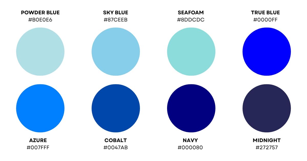
Blue lies between violet and cyan on the visible spectrum, with wavelengths in the 450 to 495 nanometer range. Purer blues tend to linger closer to 470. In standard color notations, “pure” blue is hex #0000FF, sRGB (0, 0, 255), and in HSL numerics typically displayed as hue 240 degrees, saturation 100 percent, lightness 50 percent.
These anchors assist us in charting how the meaning of the color blue changes as the hue becomes lighter, deeper, or gentler.
- Sky Blue: Soft, high lightness, lower saturation. Denotes openness, ease, and breath, reminiscent of a clear morning sky. Great for soothing UIs, children’s hospital rooms, and introspective journal covers. Conveys friendliness and consistent hope.
- Powder and Baby Blue: Gentle, pastel shades suggest tenderness and safety. Useful when comfort counts, such as in bunkers, mindfulness apps, or water alerts on fitness bands. They are linked to rest and gentle compassion.
- Turquoise and Cyan-Leaning Blues: Where azure meets cyan, we get crisp clarity and a touch of play. This suggests freshness and clean water, bright thinking. It is good for detox, breathwork visuals, and tech dashboards where rapid readability counts.
- Azure and True Blue (#0000FF reference): Classic, balanced, stable, dependable, legible. Great for jerseys, nav bars and blackboards. Communicates trust without the weight when combined with white or light gray.
- Cobalt and Royal Blue: Saturated, energized, and confident. Implies ambition and achievement. Select for sweats, goal books, and conference room focus points. Most moderated with neutrals to avoid eye strain.
- Indigo and Deep Blue: Higher depth, lower lightness. Indicates leadership, thoughtfulness, and earnestness. Perfect for strategy papers, nighttime rituals, and concentration machines. Helps focus and deep reading.
- Navy Blue: The gravitas of blue. It was previously associated with dress shirts and business suits. It speaks of dependability, procedure, and lifetime commitment. It is great for financial dashboards, contracts, and anywhere trust needs to be crystal clear.
Lighter blues often read as open, airy, and peaceful, like spacious breathing. They damp down noise and welcome connection. Darker shades provide form and command. They stabilize the space and establish a businesslike atmosphere.
This gradient allows you to fine-tune ambience with subtle changes in lightness and saturation. Blue is a primary color in both RGB (additive) and RYB (traditional), the backbone of palettes from screens to paint.
On a color wheel, experiment with complements, such as orange, for vivid contrast, or analogous schemes, add teal and indigo, for cohesion. A tangible wheel or online chart illuminates relationships in a second and prevents collisions.
Blue is omnipresent in the sky and ocean, so serenity is a natural reaction, although culture and personal eyesight influence interpretation. Not everyone sees the same shade the same way.
Blue in Our World
Blue color symbolism weaves through the fabric of our daily lives as a signal, shelter, and mood-setter. This powerful color conveys positive traits such as trust, loyalty, and confidence, which is why banks, tech brands, and blue uniforms gravitate to it. Natural blue provides the symbolic anchor with its rich color symbolism.
- Clear skies, distant mountains, open ocean swells
- Caribbean lagoons in aqua and turquoise, coral shallows
- Blue ice in glaciers, bioluminescent bays, peacock feathers
- Cornflowers, bluebells, gentians, Himalayan poppies
- Blue morpho butterflies, kingfishers, damselfish
- Minerals: lapis lazuli, azurite, sodalite, blue opal
Blue minerals and dyes have come a long way. Lapis ground into ultramarine for medieval icons, while Egyptian blue glazed faience conjoined the sky and the god Horus, embodying both masculinity and femininity. For centuries, natural indigo and other blue dyes were expensive, making blue garments a symbol of status throughout the Middle Ages.
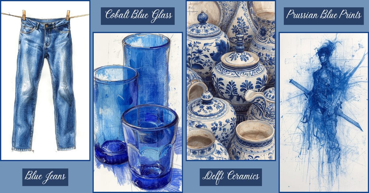
Organic dyes gave ways to synthetic colors in the 19th century and democratized color, ultimately leading to blue jeans, cobalt blue glass, Delft ceramics, and Prussian blue printmaking. Meanings still vary: in China, it was donned to ward off demons, while in Japan, the color blue represents loyalty and honesty, correlating to the season of autumn.
It exudes authority in Western law enforcement uniforms and graces weddings as ‘something blue,’ which stands for fidelity. Psychologically, it decelerates the pulse and facilitates concentration. Blue walls in bedrooms or studies cool a warm climate room, soften stress, and aid concentration.
Clothing choices matter too: navy communicates credibility in interviews, while softer shades read as approachable, and bright cyan feels energetic. Not all blues are created equal. Caribbean waters can brighten up on sight, whereas an overuse of cold, grayish blues can feel aloof. Even eye color stories evolve, with blue eyes now appearing in about one in six Americans, a share that keeps declining.
Blue In Home Design
Blue is the color we trust. It’s built into public spaces to signal safety and calm. Airports, hospitals, and transit systems use mid to deep blues for wayfinding and reassurance. Corporate lobbies lean on navy and slate for trust.
Wellness studios borrow misty blue-greens to beckon languid breath. At home, use it in bedrooms, studies, baths, and small entries to cool and clarify. Stay away from weighty, cold shades in north-facing living rooms or nurseries where warmth and coziness count.
Shade directs positioning. Pale powder and silver-blue expand close corridors. Centers of our world, mid denim and steel blue anchor dining or study zones without seeming austere. Navy grounds cabinets or doors and imbues authority.
Teal and turquoise invigorate kitchens and patios, mimicking water and leaves.
Blue Fashion and Design
Blue suits most skin tones because undertones differ, from warm teal to cool navy. Individuals looking to convey dependability—therapists, accountants, professors—do well with navy or midnight. The expressive palettists among you may forgo bold royal blue close to the face, opting for dustier blue-grays or teal inflections.
Designers use a spectrum: powder and sky for soft tailoring and bridal “something blue”; chambray and denim as everyday workhorses; cobalt and electric blue for statement dresses, sneakers, and sportswear; navy for suiting, coats, and leather goods; teal and petrol for knitwear and scarves that flatter mixed undertones.
In uniforms, Western cops in blues indicate reliability and safety, a prompt mimicked in business attire. Streetwear frequently combines cobalt with iridescents, a wink towards screen and LED strip digital blues.

Blue’s Digital Footprint
The color blue shows up across our screens because it carries steady signals: trust, calm, and clarity. Readers perceive it as a powerful color associated with tranquility and meditation, making it a favorite color for designers. However, it can veer towards somber, so designers carefully calibrate different shades and contrast.
Blue in Digital Branding
Almost every major platform leans on blue to frame trust and approachability. Facebook, Twitter/X, LinkedIn, and Skype all use blue marks to indicate reliability and transparent communication. Banks, health portals, and cloud services fall in line — PayPal, American Express, IBM, and Intel — because the color implies loyalty, wisdom, and technical prowess.
Studies in user perception frequently demonstrate higher credibility rankings for blue interfaces compared to warmer palettes. Not all shades are the same. Lighter toners come across as friendly and social, while deep navies feel institutional and secure. World brands adjust saturation for culture and context, holding the safe promise without muting verve.

Blue for Links and Interface Cues
Blue links persist because the color pops against white backgrounds and is still readable by numerous people with color-vision variations. Even when brands shift to custom palettes, the “blue link” convention anchors usability: people recognize actions, trust the cue, and move faster.
Tons, toggles, and notifications are in action too—blue for primary things—Join. Save. Send—because it’s low threat and has high clarity. Designers couple blue with distinct labels and generous contrast to ensure there’s no ambiguity and to maintain accessibility compliance.
Blue Light, Sleep, and Focus
Screens shine blue light that encourages wakefulness by inhibiting melatonin. This enhances cognitive performance during the day but impedes sleep when exposure extends into late night. Night modes, warmer display profiles, and blue-light filtering glasses aid in reducing strain.
The impact isn’t solely physiological. While some users say interfaces feel crisp and clean, others describe them as chilly or eye-fatiguing. Since sensitivity differs, device settings and app themes provide options that are cool for work and warm for bedtime.
Blue Aesthetics and Evolving Trends
Blue wallpapers—ocean horizons, dusk gradients, cyberpunk neon—are still a hit because they calm overloaded home screens and crisply frame icons. Blue-themed apps tap the color’s creative side in digital art platforms and photo editors, where cyan and indigo drive mood from serene to introspective.
As artists chart emotion with blue, from calming washes to brooding monochromes, they reverberate a deep digital lineage of it in photography, UI skins and game worlds. With OLED, HDR and ambient displays on the rise, designers experiment with luminous blues, kinetic gradients and adaptive palettes that change with the time of day.
The footprint continues to expand—serene when we seek serenity, cutting when we seek cutting edge, lyrical when we seek lyricism.
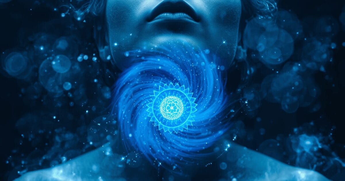
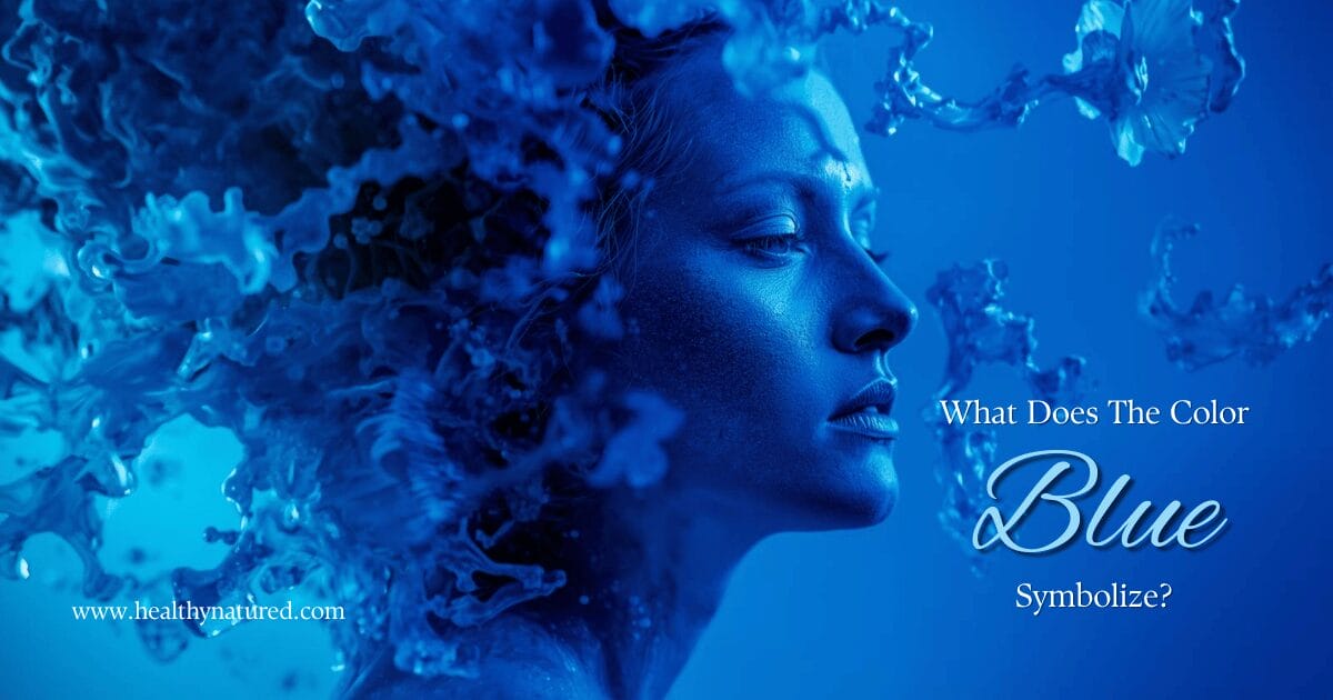
The Esoteric Blue
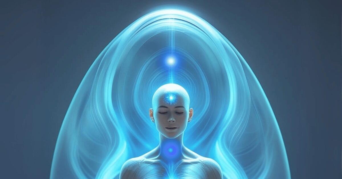
Blue, a powerful color, has a steadying presence throughout spiritual systems, associated with truth, calm, and a transparent conduit between inner voice and outer expression. In color psychology and spirituality, it is linked to the throat chakra, where speaking, hearing, and honesty converge. Traditions such as Kabbalah and Hinduism associate it with wisdom, oceans, heavens, and the divine.
Medieval European art depicted blue as a symbol of virtue and femininity, while Catholic iconography frequently dresses Mary in azure garments to suggest purity, protection, and motherhood. Ancient Greeks and Romans lacked an exact word for blue; Romans referred to the sea and sky as ‘caeruleus.’ This color later rose to dominance, appearing on the color wheel in the 18th century and flourishing in art after the introduction of synthetic blue dye in the 19th century.
How does blue affect mood esoterically?
Esoterically, it is a multifaceted color influencing mood by representing:
Spirituality and Divine Connection: It is seen as a color of spirituality and a connection to the divine, influencing one’s sense of inner peace and aspiration.
Intuition and Inspiration: It represents intuition and inspiration, which are spiritual qualities, and promote clarity and focus.
Protection and Healing: Esoterically, it is linked to protection from negative energies, creating a sense of safety and security. It’s also believed to have emotional healing properties, helping individuals move past past hurts and trauma.
In practical wellness does blue affect emotions? Yes, the calming color blue reduces stress and encourages tranquility, which is why it frequently if found in therapy suites and meditation rooms.
Blue Soul and Aura
A “blue soul” refers to a disposition attracted to honesty, attentive listening and empathetic outreach. These are the folks who pose genuine inquiries, strive for even-handedness and calm strife instead of stoking it.
In aura reading, blue indicates honesty, intuition, and spiritual connection. Sky shades indicate soft speech and an open mind. Deep or royal shades may indicate spiritual maturity and defined boundaries.
When this color cocoons around the throat, it reflects Vishuddha—the fifth chakra—which governs voice, clarity, and ethical speech. Balanced Vishuddha means calm breath and clear speech. Shadow patterns include people-pleasing, silence born of fear, gossip, or rigid “truth” that forgets empathy.
In dreams, this color frequently signifies the light of understanding following chaos, catharsis, or restorative pivot—like smooth water after a tempest or pristine air after a shower.
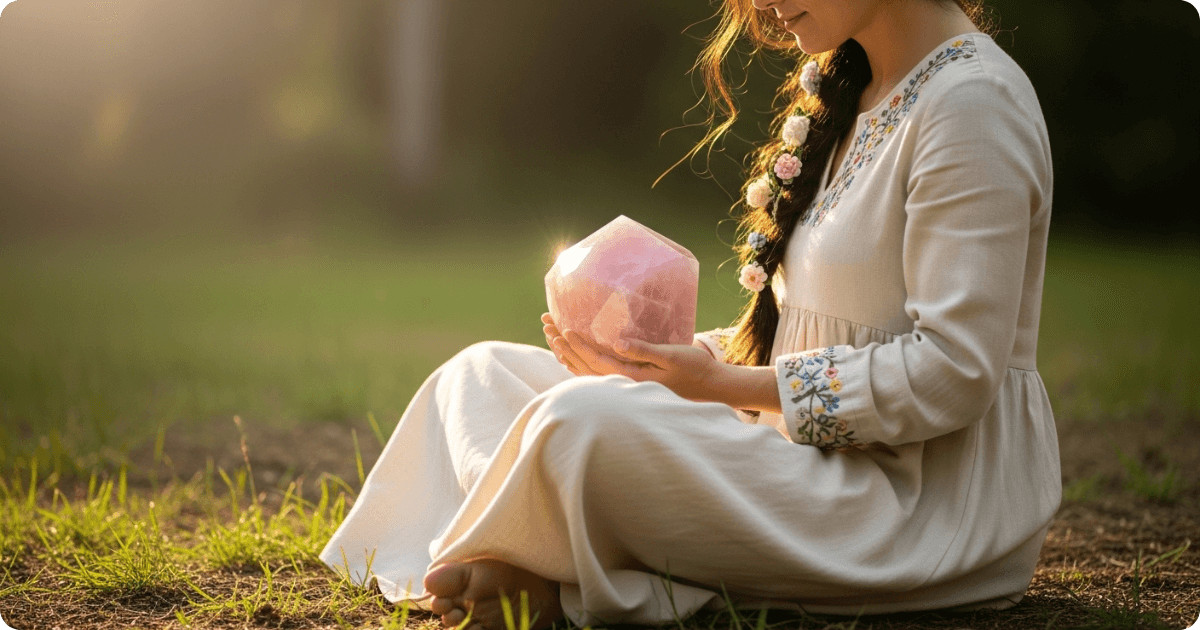
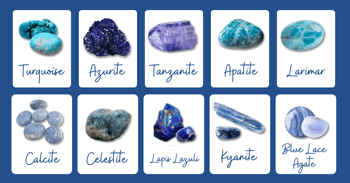
Blue Crystals
The color blue in crystals tends to cool the nervous system and clarify thought, making it a powerful color that complements Vishuddhas blue color symbolism and practices such as light breathwork and mindful conversation.
- Blue Kyanite (bright): alignment, communication, clarity. Aries, Libra. Meeker: ‘I’m aligned and speak with ease.’
- Blue Apatite (deep): self-expression, intellectual clarity. Gemini, Libra. “I communicate clearly and confidently.”
- Azurite (dark): intuition, spiritual insight. Sagittarius, Capricorn. “I am open to the wisdom of the universe.”
- Turquoise (bluey-green): protection, healing, balance. Sagittarius, Scorpio. ‘I am shielded and centered.’
- Lapis Lazuli: Blue (deep) with gold and represents wisdom and truth. It is associated with Sagittarius and Libra. The affirmation is “I embrace my inner wisdom and truth.”
- Blue Calcite (light): calming, emotional healing. Cancer, Pisces, ‘I’m relaxed and peaceful.’
- Celestite (pale): spiritual awareness, higher consciousness. Gemini, Libra. “I am connected to higher realms.”
Meaning Of The Color Blue In Feng Shui
Esoteric Blue Feng Shui is connected to the Water element, which is associated with flow, wisdom, and life path. Employ ocean paintings, spherical vases, silk cushions, or glazed ceramics to evoke a down-to-earth, flowing tone.
Family Area: Soft to mid blues nourish harmony and honest dialogue.
Knowledge Area: Dark shades for study, self-cultivation, and strategic career moves.
Bedrooms: Light shades on walls or linens support deeper rest and lower stress.
Living Rooms: Mid blues and teals suggest renewal and fresh starts.
North Sector: Water-themed art or blue glass activates life path energy.
Blue Color Symbolism Conclusion
Blue narrates an unmistakable, multifaceted tale. Psychologically the meaning of the color blue associates with serene concentration and unwavering faith. Cultures wrap the color blue in defense, knowledge, and the divine. The range extends from gentle celestial to , with every hue influencing sentiment and significance. Nature offers us few blues, and those blues mean depth and distance. Screens render blue into marks that steer design, focus, and reach. In spiritual work, blue is often associated with truth, clarity, and voice.
Important to remember when looking for blue color symbolism, context is everything. Lighting, materials, and cultural background all change how blue feels and functions. So use it deliberately. Try swatches in real environments. Match it with intention — talk, sleep, think. Over the years, patterns emerge. Blue turns into not just a color, but a useful tool for more transparent living.